
Addressfinder's Fresh Look
Misc - - 2 min read
This article was originally published on the Addressfinder blog.

We’ve got some exciting news to share! Our website has undergone a significant transformation, and we couldn’t be more thrilled to show you around.
Why change?
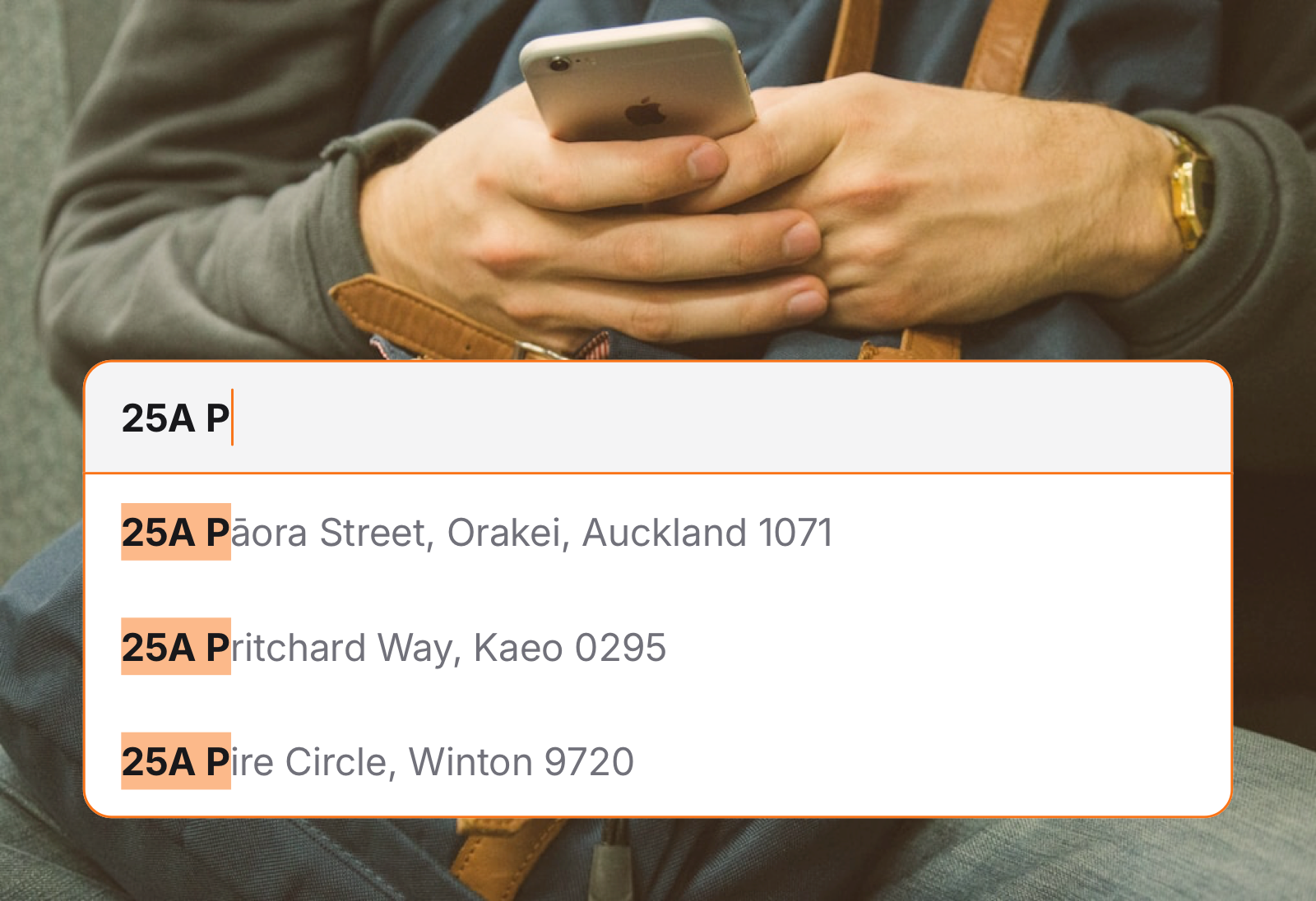
Let’s be honest, addresses are hard. And so is explaining complex verification services in a way that makes sense to everyone. Our old website was packed with features but struggled to communicate the real magic of what we do.
Our new website isn’t just a fresh coat of paint. It’s a complete reimagining of how we tell our story.
What’s changed?
A look that matches our personality
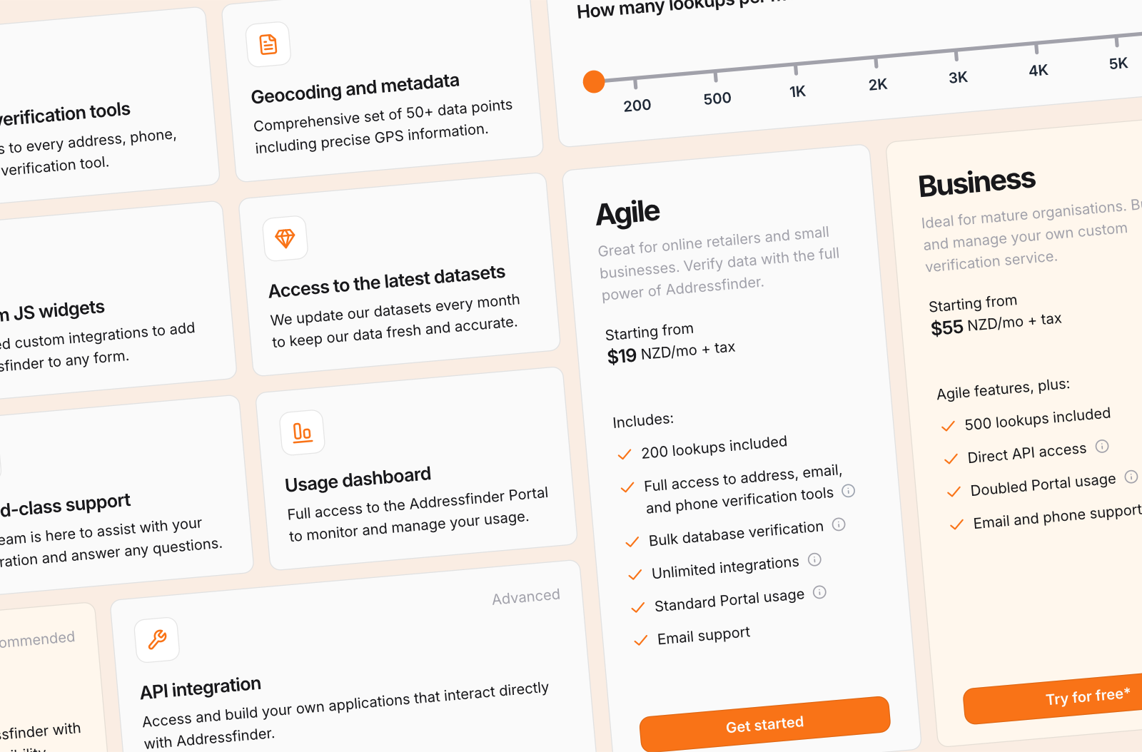
We’ve embraced a bold new orange brand color that reflects our energy and approachability. But it’s more than just aesthetics. We’ve carefully redesigned every element to make our message crystal clear: we make data verification simple.
Outcome-focused messaging
Gone are the days of technical jargon that only developers could love. Now, we’re laser-focused on explaining the real benefits:
- Collect more accurate customer data
- Reduce form friction
- Improve your overall data quality
Easy navigation, clear value
We’ve restructured our entire documentation architecture to answer the most important question: “What’s in it for me?” Whether you’re a developer, a product manager, or a business leader, you’ll instantly understand how Addressfinder can solve your data challenges.
Our promise remains the same
Addresses are hard. Let us make it easy for you.
While our look has changed, our core promise hasn’t: helping our customers seamlessly collect and verify address, email and phone data.
What’s next?
This website refresh is just the beginning. We’re laying the groundwork for exciting expansions and improvements to our entire product suite. Our customer dashboard and verification tools are next in line for a thoughtful, user-centric redesign.